Written by Team Wizikey
August 27, 2021
PR Measurement – Part 1 | Why we need to talk to Newton
In the world of PR, measurement is a problem. Force applied is pretty evident, but how do we assess value? Our mission is to find that elusive measure.
Physicists define work done as force applied multiplied by distance travelled.
Work = Force x Distance Travelled
This seems like a simple formula when you apply it to the textbook problems of physics. Try and apply it to real life, and it starts to get confusing. For example, imagine your employer decides to pay you according to the force applied (to develop product features) and distance moved (in terms of features delivered). This could be a bit unsettling, no?
Essentially, it means that in order to measure the work done, we need to look at both the effort put in and the progress made. Apply this to the world of PR, and the measurement problem becomes that much harder. The force applied (pitches, interactions, interviews, media rounds, press conferences) is pretty evident, but when it comes to measuring the distance travelled, PR folks are left grappling. The coverage count does not always cut it because there are so many questions – on the credibility of publications, the tone/sentiment of coverage, and whether it was a proactive effort at all. This is why PR folks have a hard time assessing and communicating the work done (or its value).
Finding Neverland Series
We are on a mission to find the Neverland of PR measurement and attribution. And we want the final solution to be as elegant as the formula for work done. This series of blogs will chronicle our journey. It will include our thoughts, struggles, and the features we build in our quest. We work by breaking down the problem into smaller parts by asking ourselves: what are all the indicators that measure the success of a PR program?
Quality vs quantity
The first one is definitely the volume of news. This is a commonly used measure, and by weighing it with the credibility of publications, it is a good indicator. But then not all coverage is created equal even after adjusting for publication credibility. So, we went a bit deeper and we started to look at Headline Grab (read: What’s in the Headline?), which is the equivalent of land grab – but of news headlines. We continue our research from this angle, where we try to look for other metrics that measure the nature/impact of media mentions.
Outreach measures
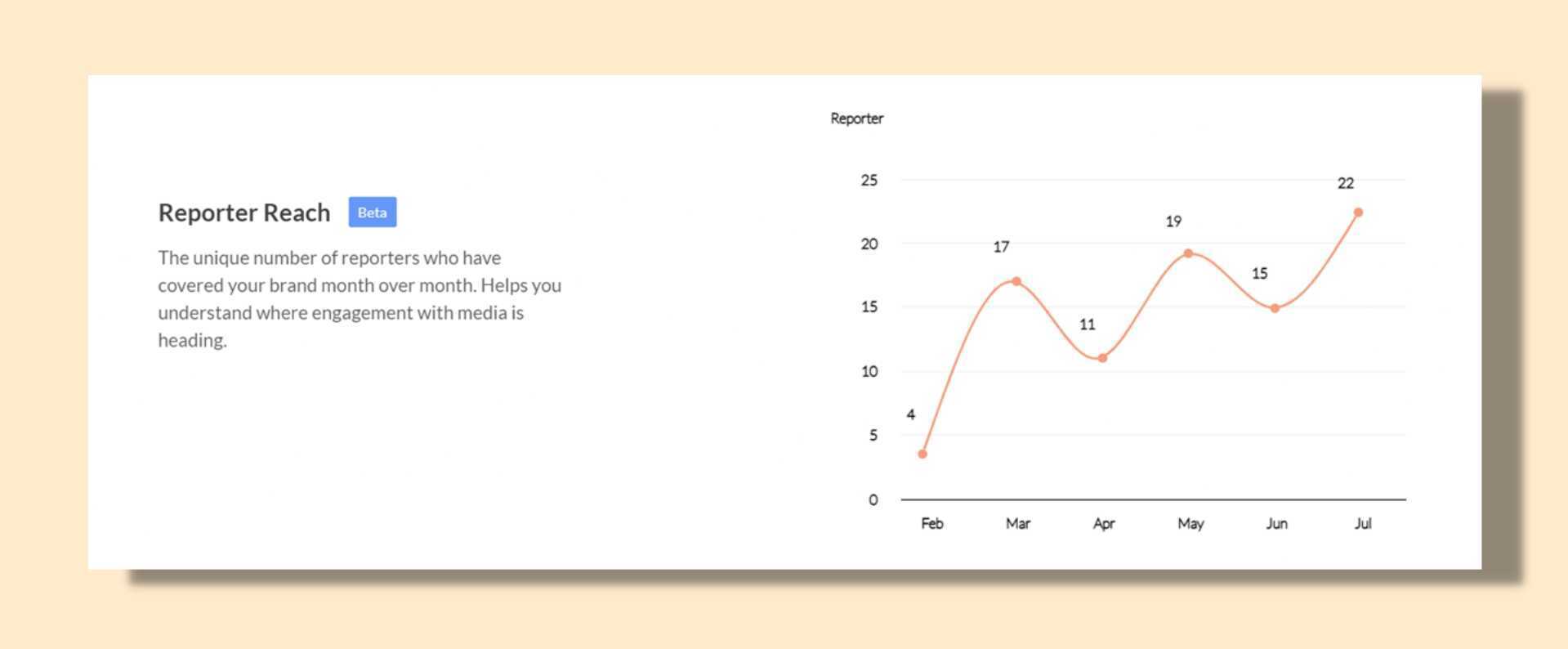
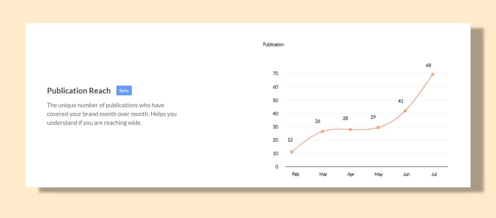
Another angle we are exploring is reporter and publication reach. If most of your mentions are from a limited number of reporters and publications, it could mean you are not proactively expanding the reach of your brand among the media community. And that’s where we bring you two new metrics: the unique number of reporters who cover your brand, and publications that mentioned you over a period of time. This gives you a sense of your trajectory, and if you have an increasing curve you know you are doing a good job. You don’t want all your eggs in the same basket, do you? This is what a typical chart on Reporter Reach and Publication Reach looks like:


We hope that you are as thrilled as we are when we create these pieces of art!
Our Product Team continues to work (yes, applying force) to bring more metrics to you, with more angles. Taking stock of our journey so far, we now have FOUR metrics to offer you: total count of mentions, mentions in headline, reporter reach, and publication reach. Stay tuned. We will be back with more!
In the meantime, if you would like a demo of our product, please click here.
Related Posts
Not All Coverage Is Equal: Take Control with Wizikey’s Custom Tags
Not all media coverage means the same thing—and now, your dashboard gets it. With Wizikey’s Custom Tags, you can define what every mention represents, analyse performance your way, and unlock deeper PR insights without spreadsheets. It’s smarter, faster, and built for how modern PR teams actually work.
Product Updates
•Apr 14, 2026
User Roles in Wizikey: Understand Who Can Do What?
User roles in Wizikey. Understand how Owners, Admins, Agency, and Members shape access across your Wizikey workspace and help PR efforts.
Real-Time Print Alerts: Why Print Monitoring Matters for PR Teams
Real-Time Print Alerts are no longer optional for PR teams managing reputation at scale. Let’s start with a familiar situation. It’s a normal weekday morning. You’re scanning dashboards. Online mentions look stable. Social chatter feels manageable. Someone forwards a PDF in the leadership WhatsApp group. A print headline reads: “Regulators Seek Clarification on [Brand] Operations” […]
Wizikey saves time by bringing relevant brand mentions from news, blogs, podcasts and other mediums in one place. It provides insights to build better awareness. It is built by communications' professionals who struggled with excel sheets, clunky software and decided to solve it themselves.
Contact Us
USA Office: 1441 Norman Drive, Sunnyvale CA 94087, USA
© 2026 Wizikey. All rights reserved
